
Communication Strategy: Bloomwave Records
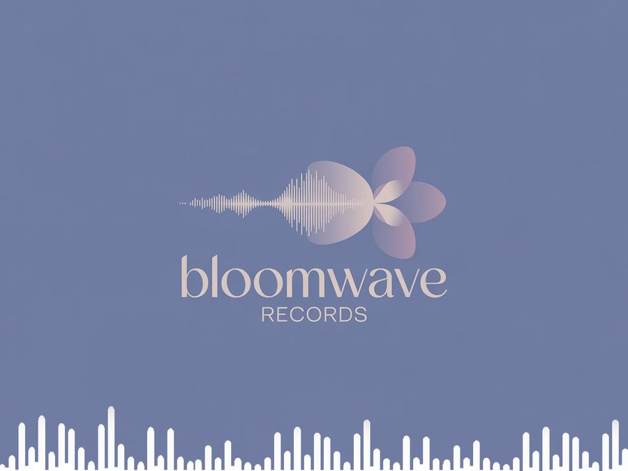
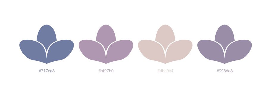
Bloomwave Records logo and color palette
This capstone project involves the creation and presentation of a comprehensive brand identity for an imaginary startup music label, BloomWave Records. The label specializes in curating and promoting ambient, neo-classical, and experimental electronic artists, with a core mission to discover «sound in its most organic, evolving state.» The presentation is structured into five distinct parts, each demonstrating the application of communication theory to practical design and branding challenges.
Theoretical Framework
Bridging Theory and Practice: How Communication Models Shape Design
Bloomwave Records is built on the idea that design is not decoration — it’s communication. Every visual element sends a message, and communication theories help structure how that message is created and interpreted. Several models from the course guided the project. Each was chosen for a specific, practical reason.
1. Semiotics — turning ideas into visual meaning
Semiotics treats logos, colors, shapes, and textures as signs. For Bloomwave, this theory helps translate the concept of «organic sound» into clear visual symbols.
1. The sprout‑shaped wave signals growth and the natural evolution of sound. 2. Earthy gradients evoke organic and atmospheric qualities. 3. Soft palettes symbolize the digital layer of production and have symbiosis with nostalgia.
Semiotics ensures the visuals communicate meaning rather than just style.
Brand floppy disk
Brand vinyl record
Brand vinyl record
2. Shannon–Weaver Model — keeping the brand message clear
This model explains communication as a message traveling through a channel with possible noise.
Bloomwave uses it through: 1. Consistent color palettes, 2. Repeated visual motifs, 3. Clear logo guidelines, 4. Controlled type hierarchy.
These design choices reduce «noise», helping the brand stay recognizable across different platforms.
Brand cap
Brand t-shirt
Brand guitar case
3. Encoding/Decoding — adapting messages for two audiences
Bloomwave communicates with both listeners and industry professionals. Hall’s model explains how they decode messages differently.
Listeners respond to emotional imagery and atmosphere. Professionals respond to structure, logic, business clarity.
This theory justifies having two distinct presentations with different tones and visual languages.
4. Rhetorical Theory — shaping persuasion for each audience
Every presentation tries to persuade. Rhetorical tools help to aim the message correctly.
Pathos (emotion) drives the general audience deck. Logos (logic) drives the professional deck. Ethos (credibility) supports the brand across all materials.
Brand Presentation (General Audience)
Bloomwave Records: A New Habitat for Sound. Bloomwave Records explores the living nature of music — focusing on ambient, neo-classical, and experimental electronic artists who treat sound as something that grows, shifts and evolves.
Brand Story & Mission. Bloomwave uncovers artists who work with «growing sound». Every track is treated as a living form with its own shape and movement.
Theory link: interpretive tradition — meaning arises through the listener’s experience.
Visual Identity. 1. Logo: a wave growing like a sprout. 2. Colors: earthy, plant-like gradients. 3. Imagery: botanical elements mixed with equalizer. 4. Typography: soft organic curves + modern clean shapes.
Theory link: semiotics gives meaning to visuals; Shannon–Weaver supports consistency to avoid «noise».
Target Audience. People who value immersive, atmospheric listening and see music as a sensory experience.
Theory link: phenomenological tradition — meaning formed through personal perception.
Artist Roster & Albums. Album mockups focus on emotional tone and atmosphere — the strongest use of pathos.
Brand digipack
Social Media Presence. Poetic captions, calm visuals, organic textures, and behind-the-scenes soundscapes.
Theory link: Encoding/Decoding — emotional encoding for listeners lifestyle and values.
Brand Presentation (Professional Audience)
Bloomwave Records: Strategic Protocol
While the general presentation focuses on mood, the professional version emphasizes clarity, structure, and long-term vision.
Brand outside wall graffiti
Market Position & USP. Bloomwave positions itself as a «lab for organic sound development», combining experimental artistry with slow listening culture. Theory link: logos-focused rhetoric — clear reasoning and strategic framing.
Business Model & Distribution. A straightforward breakdown of artist development, distribution channels, collaborations, monetization, and label services.
Brand Guidelines. Strict standards for: logo usage, spacing and alignment, typography, color palette, textures and photography, motion identity.
Theory link: Shannon–Weaver — guidelines reduce noise and keep brand signals consistent.
Marketing & Launch Strategy. Combining: Ethos: credibility in niche sound culture, Pathos: emotional storytelling, Logos: market logic and structure.
Applying Course Theory to the Brand
From Theory to Practice: How Communication Models Shaped Bloomwave
1. Semiotics — gives shape to «organic sound». It transforms abstract ideas into recognizable symbols.
2. Encoding/Decoding — explains two communication styles. It justifies why two different presentations exist and how they target different interpretations.
3. Rhetoric — structures persuasion. Each audience gets the type of persuasion that fits their expectations.
4. Shannon–Weaver — provides clarity and structure. It explains why consistency and guidelines matter in branding.
5. Craig’s Traditions — show the multi-layered nature of communication. Bloomwave incorporates: — semiotic (symbols), — rhetorical (persuasive meaning), — cybernetic (channels), — phenomenological (experience) approaches.
Conclusion
Synthesizing Theory, Design, and Brand Vision
Bloomwave Records demonstrates how theory can enhance design. Communication models guided each decision, turning abstract ideas into a coherent brand.
Semiotics gave meaning to visuals. Encoding/Decoding shaped communication for two audiences. Rhetoric structured persuasion. The Shannon–Weaver model ensured clarity.
The result is a brand that feels alive, intentional, and communicative — a space where design, sound, and meaning grow together.
https://edu.hse.ru/course/view.php?id=133853 (дата обращения: 12.12.2025)
Логотип сгенерирован при помощи Ideogram AI https://ideogram.ai/t/explore (дата обращения: 13.12.2025)
https://coolors.co/palettes/popular/music (дата обращения: 13.12.2025)
https://www.behance.net/gallery/179379721/Vinyl-Record-Mockups (дата обращения: 14.12.2025)
https://www.behance.net/gallery/203635825/Guitar-Box-Logo-Mockup? tracking_source=search_projects|guitar+mockup& l=2 (дата обращения: 14.12.2025)
https://t.me/jamfiles/6068 (дата обращения: 14.12.2025)
https://t.me/jamfiles/5752 (дата обращения: 14.12.2025)
https://t.me/gangdownload/2678 (дата обращения: 14.12.2025)
https://t.me/gangdownload/2241 (дата обращения: 14.12.2025)
https://mockups-design.com/6-panel-digipack-mockup/ (дата обращения: 14.12.2025)
https://www.pinterest.com/pin/136867276172442987/ (дата обращения: 14.12.2025)
https://www.pinterest.com/pin/26247610323844040/ (дата обращения: 14.12.2025)
https://www.pexels.com/ru-ru/photo/30028234/ (дата обращения: 14.12.2025)


