Communication theory in the field of design
Design is, at its core, a form of communication. Every visual decision — color, shape, typeface, composition or interactive element — carries a message from the designer or the brand to the audience. Communication theory allows us to understand how these messages are created, how they are interpreted, and why certain designs resonate more strongly than others.
Early communication models describe the process as a simple sequence: a sender encodes a message, sends it through a channel, and a receiver decodes it. Applied to design, this suggests a clean path between intention and understanding. Yet in practice, design rarely operates in such a linear way. Meaning does not travel unchanged from creator to viewer; it is shaped and reshaped by context.
The Emmert–Donaghy framework highlights that communication always exists within a physical, cultural, social and technological context. In design, this means that no visual message is ever universal. Its meaning depends on where it appears, who experiences it, and what associations or expectations the audience brings. A poster, a game interface, a brand identity or a product page will never be interpreted in the same way across different environments. Context is not merely a background for design, it actively shapes how the message is read.
Semiotics deepens this understanding by framing every design element as a sign. Colors, shapes and typography do more than decorate; they signal emotions, attitudes and values. Designers encode meaning through these signs, but the meaning itself is not fixed. It emerges through the interaction between the design and the audience, influenced by cultural references, personal memories, habits and learned visual language. In this sense, design is not simply the delivery of information but a collaborative process of meaning-making.
This is why one cannot assume that a viewer will interpret a visual message exactly as intended. Effective design demands an awareness of how different audiences read visual codes, what emotions they may associate with certain aesthetics and how misunderstandings might occur. A design is successful when the meaning the designer aimed to communicate and the meaning the audience constructs finally align, even if that alignment requires thoughtful framing, cultural sensitivity or intentional visual cues.
Modern communication theory also emphasizes the role of feedback. Communication is never one-directional; it is inherently interactive. Contemporary design, especially in digital environments, functions as a dialogue rather than a monologue. Users respond, remix, comment, test and reshape the message. Their behavior becomes part of the communication system itself. As a result, a design is never truly finished upon release. Audiences co-create its meaning, and brands or products evolve through this ongoing interaction.
In this broader perspective, communication theory transforms design from a set of aesthetic decisions into a dynamic, context-aware process. It helps designers understand how messages travel through cultural spaces, how they gain or lose clarity, and how audiences bring their own interpretations into the experience. Ultimately, design becomes a form of shared meaning-making: a continuous exchange between intention and perception, creator and viewer, message and interpretation.
Presentation for a wide audience
Sneaking into an old store, four friends decide to hold a competition — and destroy everything around them in the process.
Mall Mayhem is a local party game created so friends can have a great time together. The game offers light-hearted chaos, friendly rivalry, and instant fun that you can jump into with no preparation.
Promo art Mall Mayhem (2023), Sergey Zasypalov
During each match, you and your friends compete in a series of mini-games. For one minute, you’ll be racing shopping carts around small arenas whose layouts change depending on the mini-game. Shopping carts are hard to control, so collisions are unavoidable!
Promo art Mall Mayhem (2023), Sergey Zasypalov
Collect items from the shelves. Whoever has the most by the end of the timer wins.
Gameplay Mall Mayhem (2023), Sergey Zasypalov
Too lame? Then ram into your opponents! They’ll lose half of everything they’ve gathered and won’t mind, if you pick it up.
Gameplay Mall Mayhem (2023), Sergey Zasypalov
Victory doesn’t go to the last one standing, but to the one who deals the most damage to their friends. Winning a mini-game earns you a medal. Whoever has the most medals at the end wins!
Promo art Mall Mayhem (2023), Sergey Zasypalov
Mall Mayhem is waiting for you, if you are…
- fans of couch-coop games;
- a group of friends, hanging out in the evenings;
- players who enjoy real emotions and laughter;
- a family looking to spend time with a simple, fun game;
- people, who value party vibes over complicated rules.
Promo art Mall Mayhem (2023), Sergey Zasypalov
Mall Mayhem is a game that brings people together through play, laughter, and delightful chaos. We’re building a space where chaos isn’t a problem — it’s the source of fun!
Presentation for a professional audience
Communication Strategy
Mall Mayhem’s brand emerges at the intersection of chaos and structure, retail culture and social play.
Values: fun, tension, co-presence, irreverence. Personality: loud, kinetic, mischievous. Symbols: carts, shelves, crashes. Expression: bold visuals, humorous collisions. Brand core message: «Real friendships are built in Mall Mayhem!» Positioning & Uniqueness: — Environment of conflict, competition and humor; — Anti-corporate aesthetic; — Social tension release; — Low-barrier, high-chaos play.
Communication Tone
We emphasize chaos of friendship opposing the structures of corporate world. To emphasize this, promotion materials will need to be: — Hyper-energetic; — Self-ironic; — Slightly absurd but controlled; — Inclusive and non-gamer friendly.Main marketing channels: — Steam page; — TikTok / Shorts; — Discord community; — Twitch micro-streamers; — Social networks Facebook / VK.
Logo Mall Mayhem
Visual Identity
Typography Primary: Bold rounded resembling brush strokes Secondary: Rounded grotesk sans Numerals: Digital price-tag-inspiredSystem of Visual Elements: — Icons of crowns and products; — Symbols of rebellion against conformity; — Visual references to consumer culture critique.
#7884CF
#FDAC51
#E979D7
#6AC095
Trailer Structure
Rapid montage of collisions Close-ups of carts losing control Text overlays: «Communication through Chaos» «One Minute to Cause Maximum Damage» Group reactions, laughter, frustration Final payoff: «You are the terror of supermarkets!»Static Ads
A cart race with headline: «Who said consumerism can’t be fun?» Four friends laughing with score icons floating: «Friendship is temporary. Damage is forever.»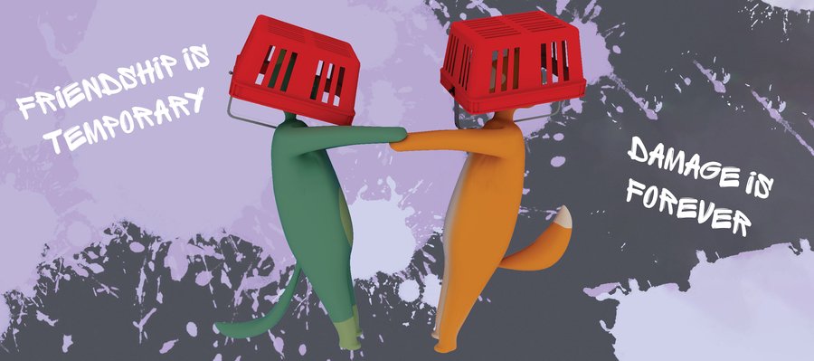
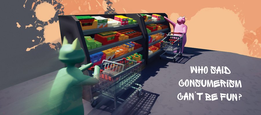
Samples of static ads
Social Media Micro-Clips
5–8 second crashes with comedic captions format«Be careful when cornering!»
Communication theory in creation and promotion of the game
Theory in game design
We used Symbolic Convergence Theory, while designing gameplay loop, which would support the creation of shared «fantasy themes», to help groups form a collective identity while playing. For achieving that goal we added anti-corporate aesthetic, recurring cooperative gags and shoping mall tropes to generate a shared imaginative space, where players can co-create meaning. This encourages formation of in-game group identities, which help players feel like a part of a distinct group, increasing emotional engagement and loyalty.In the same spirit Politeness Theory is guiding the game’s UX and social mechanics to minimize face-threatening actions between players while preserving competitive fun. Clear, humorous feedback for collisions, losses, or stolen items frames these moments as playful rather than personal, maintaining a sense of sympathy and independence and protecting both positive face and negative face. Interface cues, avatar expressions, and light-hearted audio act as «mitigating strategies» that keep rivalry safe, socially smooth, and party-friendly.
Theory in promotion materials
When designing promotion materials for Mall Mayhem, the Elaboration Likelihood Model guides how persuasive cues should be structured for different audience involvement levels. For highly engaged fans of couch-co-op games or active seekers of local multiplayer titles promotions should use central-route cues: clear demonstrations of core mechanics, competitive mini-games, control physics, and the unique «chaotic cart» gameplay loop. These players process information deeply, so developer commentary, feature breakdowns, and short mechanic-focused clips increase persuasion. For more casual audiences, like families, party-game shoppers or players driven by social fun peripheral-route cues in promotion are more effective: energetic visuals, humorous character animations, vibrant color palettes, celebratory sound effects, and social-proof elements like positive quotes or streamer reactions. By balancing central-route clarity with peripheral-route emotional appeal, the promotional system ensures that Mall Mayhem attracts both intentional game seekers and impulse-party-game buyers.Sources
Maria Mordvinova, Olga Solovyova «Communication Theory: Bridging Academia and Practice», Smart LMS [online course], 2025
Mall Mayhem [image] // Sergey Zasypalov, Студенческое портфолио HSE University Art and Design. (URL: https://portfolio.hse.ru/Project/178031). Date of request: 12.11.2025.
Mall Mayhem Trailer [gif image] // Sergey Zasypalov, YouTube. (URL: https://www.youtube.com/watch?v=m8bXR-d3508). Date of request: 12.11.2025.


