Communication Theory: Brand of acrylic markers «Drawgo»
Introduction
Communication is the process of creating meaning through the exchange of verbal and nonverbal symbols, which are central to design. The designer acts as the sender of a message, encoding an idea into form, color, composition, material, or interactive scenario. The viewer or user becomes the recipient, decoding this message based on their experience, cultural background, and context of perception.
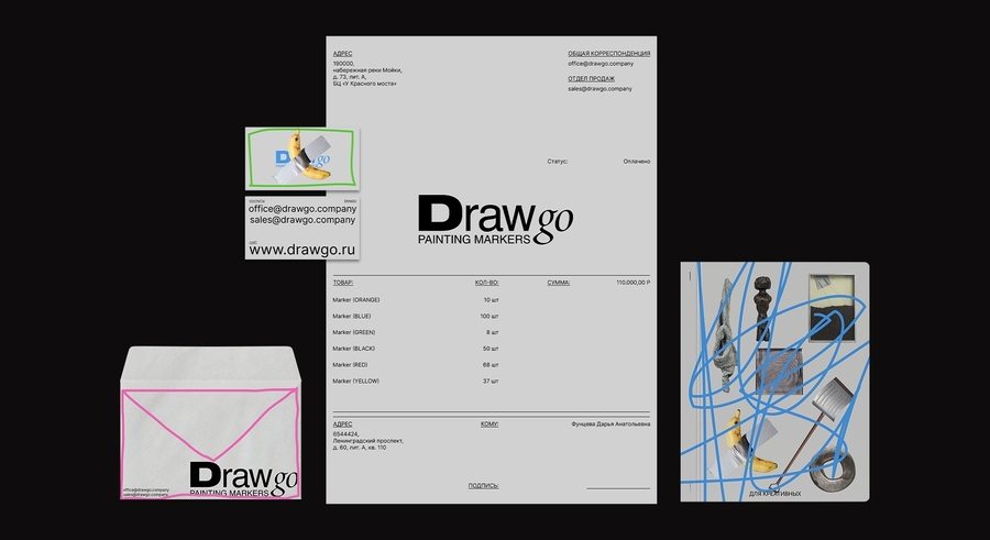
Markers are presented as a convenient and versatile creative tool that can be used on a variety of surfaces. Their quick drying time allows the artist greater freedom and allows them to work with greater boldness and confidence. This idea is conveyed not only verbally but also visually: active, free-flowing lines and strokes become an important part of communication and are associated with the drawing process itself. They demonstrate the lively interaction between the artist and the tool. The use of conceptual art objects and intentionally uneven, «imperfect» forms helps the viewer interpret the images in their own way and perceive the product not simply as a marker, but as a means for expressing ideas and creativity.
Presentation for general audience
Drawgo markers serve dual roles, supporting both artistic projects and daily tasks. More than just marking tools, they make sure marks are useful, be they planning notes, project illustrations, or journal sketches. Though appearing typical, their vibrant colors and lines create durable, clear marks. This comes from alcohol-based inks rich in pigment, which dry quickly, resist smudging, and offer good light resistance, helping creations stay bright over time.
The marker has a common design that supports varied uses. Its hexagonal shape stops it from rolling and makes it easier to hold for long periods. Also, the dual tip, with a fine liner and chisel brush, acts as a complete set, letting users switch from detailed lines to broader strokes easily.
The form of the marker is kept simple, yet its use changes. This simple shape works on the mind in a subtle way. It makes it easier to start using, because it is not too complex. People can focus on creating, not on learning how to use the tool. Drawgo lets color and freedom communicate without rules. The colors for Drawgo were chosen carefully. It’s more than just a set of colors, it’s a color system where all the colors go together well. This gives people freedom to choose easily, and they don’t need to know much about color matching.
This method supports experimentation and helps people concentrate on self-expression. The tool acts as a link between ideas and their execution by addressing technical issues. Its dependability and consistent results promote a flow state, allowing attention to shift to expressing ideas or emotions. Imagination is free, yet becomes more focused. With this kind of support, people can experiment without concern and make well-considered choices, trusting the tool’s abilities.
Drawgo’s core idea is sustainability and careful consumption, which goes against a throw-away culture, so the markers do not need to be changed regularly, which cuts down on buying. Each marker is dependable and made to last because the body is made from strong, recyclable plastic that is good for long use. They last, so you do not have to throw them away often, which is good for the planet. Instead, you can use the refill system. The packaging is strong so that you can refill it. When the ink is gone, the user can purchase a replacement cartridge. This saves resources and changes how people view the object, turning it into something permanent instead of something that is used up and tossed.
Packaging is the first time someone sees a brand. Drawgo packaging does more than contain the product. It uses thick cardboard that feels good to the touch and has a simple design that presents all information in a clear manner. By focusing on function and keeping things clear, it helps build trust with the user. Opening the box becomes a visual experience that prepares the user for serious, creative tasks and suggests the quality of the products inside. The markers are arranged for easy access, implying that it is time to start creating. The layout of the markers in the box or organizer makes each tool easy to grab, like an artist’s palette, and inspires the user to begin working.
The box should be kept as it seems related to the item inside, much like a part of it. The packaging design lacks extra decoration, meaning it fits into a workspace, like on a shelf or in a drawer, as a primary storage idea. It turns into the start of a system for creative organizing. From the start, keeping Drawgo close seems like a good idea.
This tool is meant to inspire creativity and last a long time. Drawgo exists as both a tool for professionals and a useful object. It can sit on a desk or shelf, ready to be used when inspiration hits. Its presence serves as a constant reminder to create and a helpful partner for putting thoughts into action.
Choosing a marker is a conscious decision about self-expression. Selecting a color and tip reflects a personal choice. Will you use a strong black line, a gentle gray shading, or a vibrant color for emphasis? Drawgo makes this choice a thoughtful part of your environment. It’s a system for creation that values durability, awareness, and respect for both the creative process and the creator.
Presentation for professional audience
The visual identity of Drawgo is built around the idea of expressive freedom combined with responsibility. The brand creates a balance between creative expression and conscious consumption. Drawgo uses innovative technologies and an ecologically conscious approach, ensuring bright colors on almost any surface while minimizing environmental impact throughout the product lifecycle.
Using persistent engagement with its audience, the brand was able to observe long-term expectations related to sustainability, usability, and emotional connection with creative tools.
A key aspect of the identity is the emphasis on durability and reliability. Drawgo markers are designed to maintain color intensity and performance over time, reinforcing the brand’s promises. Insights gained through focus groups with young creatives showed that durability and consistent color quality are perceived as essential components of environmentally responsible design. This philosophy reflects the brand’s belief that sustainable design is closely connected to products that last longer and encourage mindfulness instead of constant replacements.
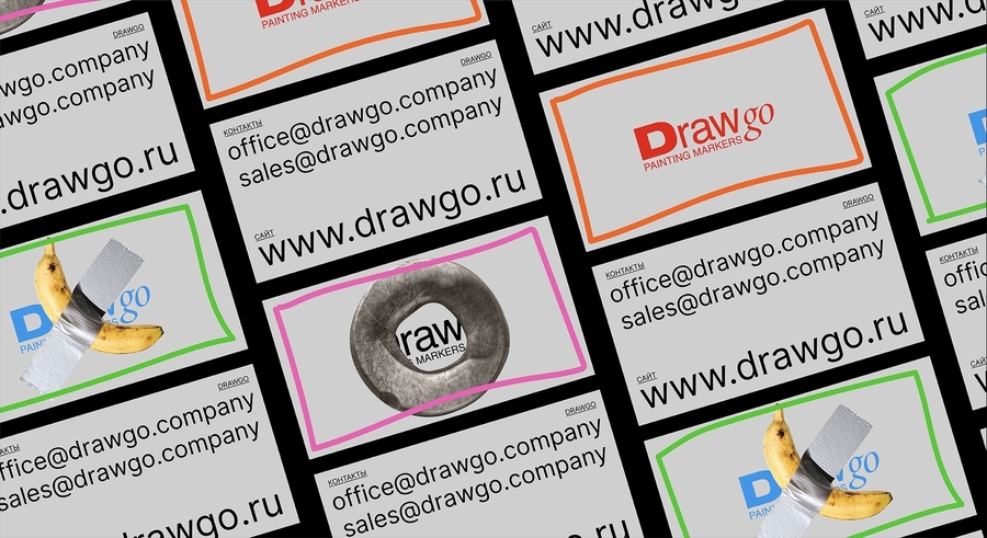
The color pallet plays a significant role in communicating Drawgo’s character and philosophy to its audience. A bright and diverse palette, including orange, red, blue, green, pink, as well as neutral gray and black, reflects the wide range of creative possibilities. Through customized engagement, the brand identified strong individual preferences for expressive color systems that support experimentation and artistic freedom. Neutral tones provide visual balance and structure, making the system cohesive.
The typographic system is intentionally restrained and functional. The Inter typeface was selected for its clarity, it allows color and imagery to take a leading role in visual communication. Feedback collected via triggered engagement at key interaction points confirmed that simple, readable typography increases trust and ease of use. This typographic choice supports the brand’s values of responsibility and reliability, reinforcing trust and accessibility in interactions with the audience.
Imagery within the brand identity focuses on objects of conceptual and contemporary art rather than traditional, purely product-focused visuals. This decision shifts attention away from the marker as an object and toward the creative outcome it enables. Results from experimental testing of visual narratives showed that conceptual imagery strengthens emotional involvement and perceived creative value. By highlighting artistic concepts, Drawgo positions its products as tools for expression and world-building. This approach strengthens the emotional connection with the audience and places self-expression at the core of the brand narrative.
Theory in action: How the course shaped our decisions
By studying communication theory, we rethought our very approach to design. A visual image ceased to be simply an aesthetic shell—it became a system for conveying meaning, where every element contributes to the overall message. The course taught us to see identity not as a random collection of graphics, but as a purposeful process of encoding a message that will be read in a specific context. It’s like language: even the simplest line or free stroke carries meaning that transcends form.
This logic formed the basis of the project for a brand of acrylic markers. We deliberately moved away from a dry listing of technical parameters in favor of a non-verbal statement. Dynamic brushstrokes, expressive lines, visual energy—all of this became a reflection of the act of drawing itself, a lively dialogue between the artist and the tool. The marker’s mark ceased to be just a mark—it became a sign of freedom, a gesture, a moment of creative impulse. This is a direct reference to semiotics, where any visual element can become a symbol.
Equally important was the emphasis on the role of the audience. We abandoned the idea of a single «correct» interpretation and created an image open to interpretation. For some, this represents pure energy and spontaneity, for others, a reference to contemporary art, and for still others, a metaphor for creative liberation. This approach reflects the very essence of communication as a process in which meaning is born not at the moment a message is sent, but at the moment it meets the viewer, their experience, and perception.
As a result, communication theory ceased to be an abstraction and became a practical tool. It helped us build the identity not as a set of graphic rules, but as a living communicative space. The markers in this project are more than just a product. They become a medium, a conduit of meaning, linking the brand, the artist, and the cultural context into a single, continuous dialogue.
The project was created based on the material from the course «Communication Theory».
DRAWGO // PORTFOLIO URL: https://portfolio.hse.ru/Project/186593 (Дата обращения: 09.12.2025)
